Discrete Vs Continuous Data: Classification And Practical Implications
Discrete and continuous data represent two fundamental types of metrics. Misclassifying them can affect forecasting, dashboards, KPIs, and strategic decisions. This blog covers clear distinctions, practical examples, actionable guidance, and executive-focused insights to improve reporting accuracy and data-driven decision-making.
Your dashboard looks clean.
The numbers are moving.
The growth chart feels promising.
But here is the uncomfortable question: are you interpreting the right type of data the right way?
Most B2B SaaS teams focus on volume. More leads. More demos. More pipeline. At the same time, they monitor revenue per user, customer lifetime value, churn rate, and session duration. All of these metrics sit side by side in reports. Yet they are not the same type of data.
This is where Discrete Vs Continuous Data becomes more than a statistics lesson. It becomes a business decision lever.
When teams misunderstand the difference between discrete and continuous data, they apply the wrong forecasting models. They choose misleading visualizations. They compare metrics that should not be compared. Over time, small classification errors compound into flawed projections and misaligned budgets.
The difference between discrete and continuous data directly affects how you interpret growth, predict revenue, and justify investment.
In this blog, you will see how Discrete Vs Continuous Data applies to SaaS dashboards, marketing attribution, and revenue forecasting. You will also understand the practical implications that separate accurate reporting from confident guesswork.
Key Takeaways
- Discrete data represents countable units, while continuous data reflects measurable quantities.
- Correct classification ensures accurate statistical analysis and forecasting.
- Choosing the right visualization depends on whether your metric is discrete or continuous.
- Misclassifying data can lead to misleading averages, flawed reports, and misaligned decisions.
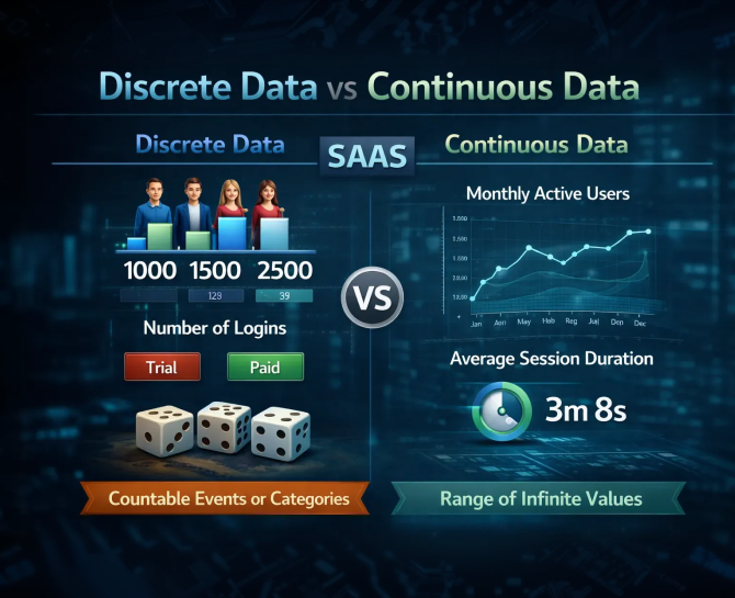
What Is Discrete Data?
Not all numbers behave the same way. Some metrics move in clear, countable steps. They increase one unit at a time and cannot be split into meaningful fractions. This is the essence of discrete data.
Discrete data represents quantities you can count individually. If a metric answers the question “how many,” it is most likely discrete.
Key Characteristics Of Discrete Data
- Represent countable, distinct units.
- Appear as whole numbers.
- Increase or decrease in fixed increments.
- Reflect individual events or entities.
For example, you can have 10 products sold or 11 products sold, but 10.6 products does not make sense in reporting terms. This stepwise nature is what sets discrete data apart from continuous data, which can take any value within a range.
Discrete Data Examples
Discrete data is common in everyday measurement and reporting:
- Number of items produced.
- Number of customers or clients.
- Number of transactions completed.
- Number of service requests or tickets.
- Number of defects detected in a batch.
Each of these represents a separate, countable event or entity. They cannot be meaningfully broken down into fractions or decimals.
Why Understanding Discrete Data Matters
Counting alone is not enough. Misidentifying discrete data as continuous can lead to errors in analysis, reporting, and forecasting.
For instance, if you record 245 customer inquiries one month and 310 the next, the change is an exact count: 65 more inquiries. This number cannot be divided or averaged in the same way as measurable data like weight, revenue, or temperature.
Recognizing that a metric is discrete ensures you apply the correct statistical approach, choose the right visualization, and avoid misleading conclusions.
Discrete data typically answers operational questions such as:
- How many units were sold?
- How many orders were placed?
- How many issues were resolved?
These simple counts form the backbone of reliable reporting and informed decision-making.
What Is Continuous Data?
While discrete data counts separate events, continuous data measures quantities that can take any value within a range. These are metrics you can measure, not just count.
If a metric answers “how much” or “how long,” it is usually continuous. Continuous data often includes decimals, averages, and percentages, making it suitable for trends, ratios, and detailed analysis.
Key Characteristics Of Continuous Data
- Represent measurable quantities.
- Increase or decrease smoothly rather than in fixed steps.
- Reflect properties that can be subdivided meaningfully.
For example, a container may hold 2.5 liters of liquid, or a journey may take 3.75 hours. Unlike discrete data, these values are not limited to whole numbers.
Continuous Data Examples
Continuous data appears in a variety of contexts:
- Temperature readings over a day.
- Revenue per customer or transaction.
- Weight, height, or length measurements.
- Website session duration or load times.
These metrics are measured rather than counted. They allow more precise analysis and can reveal subtle patterns that discrete counts cannot capture.
Why Understanding Continuous Data Matters
Treating continuous data as discrete, or vice versa, can lead to flawed interpretations. For instance, averaging discrete counts may not make sense for small sample sizes, while treating a continuous variable as discrete can mask trends.
Correctly identifying continuous data ensures:
- Appropriate statistical methods are applied.
- Graphs and charts reflect the true distribution of values.
- Forecasts and models capture accurate trends.
- Decisions are based on meaningful, measurable insights.
Continuous data typically answers questions like:
- How much revenue did a campaign generate per user?
- What is the average temperature, speed, or weight?
Understanding the distinction between discrete and continuous data sets the stage for accurate analysis, reliable reporting, and informed decision-making.
Discrete Vs Continuous Data: Core Differences
Understanding discrete and continuous data becomes easier when you see them side by side. The following table highlights their core differences in a clear, practical way.
| Factor | Discrete Data | Continuous Data |
|---|---|---|
| Nature | Countable units | Measurable quantities |
| Values | Whole numbers only | Can include decimals or fractions |
| Movement | Stepwise | Smooth or continuous |
| Examples | Number of orders, tickets, customers | Revenue, weight, time, temperature |
| Visualization | Bar charts, pie charts | Line charts, histograms, scatter plots |
| Statistical Methods | Binomial, Poisson | Normal distribution, regression, correlation |
Why Discrete Vs Continuous Data Matters In Reporting
Understanding the difference between discrete and continuous data is more than a theoretical exercise. It directly affects how reports are built, insights are drawn, and decisions are made. Misclassifying metrics can lead to flawed forecasts, misinterpreted trends, and poor business decisions.
Practical Implications
- Improve Forecasting Accuracy: Correctly identifying discrete versus continuous metrics ensures that predictive models reflect real-world behavior. Count-based metrics require different methods than measurable, continuous variables.
- Select Correct Statistical Models: Discrete data often follows distributions such as binomial or Poisson, while continuous data aligns with normal distributions or regression models. Using the wrong model can distort results.
- Design Dashboards Correctly: Visualization choices depend on data type. Discrete metrics work best with bar or pie charts, while continuous metrics are more meaningful in line graphs, histograms, or scatter plots.
- Prevent Misleading Averages: Averaging discrete counts without context can produce unrealistic insights. Continuous data, however, supports meaningful averages and trend analysis.
- Align Reporting Across Teams: Teams often mix discrete and continuous metrics in dashboards. Recognizing the distinction ensures marketing, finance, and operations interpret metrics consistently, reducing confusion and improving cross-functional decisions.
By applying these principles, teams can turn raw numbers into actionable insights, avoid misinterpretation, and make reporting a strategic advantage rather than a source of errors.
Case Scenario: When Data Classification Goes Wrong
Misclassifying data is more common than most professionals realize, and the effects often extend beyond a single report. Understanding whether a metric is discrete or continuous can prevent flawed forecasts, misleading dashboards, and poor decision-making.
Scenario
Consider a company tracking weekly customer inquiries:
- Week 1: 245 inquiries
- Week 2: 310 inquiries
- Week 3: 275 inquiries
If the marketing team treats this count of inquiries as continuous data and applies a trendline or linear regression, the forecast may output fractional values such as 298.6 inquiries for the next week.
Why This Matters
- Inaccurate Forecasts: Discrete metrics cannot logically produce fractional results. Forecasts that ignore this stepwise nature misrepresent reality.
- Misaligned Resource Planning: Staffing and budget decisions based on inaccurate projections may be over- or under-allocated.
- Misinterpretation of Trends: Small fluctuations in counts can appear as trends when treated as continuous, causing unnecessary strategic changes.
- Cross-Team Confusion: Finance, marketing, and operations may report or interpret the same metric differently if data classification is unclear.
Lessons Learned
- Validate Metric Type Before Analysis: Always determine whether a metric is a count (discrete) or a measurement (continuous) before modeling or visualizing.
- Choose Appropriate Statistical Methods: Use count-based distributions for discrete metrics and regression or normal-based analysis for continuous metrics.
- Use Correct Visualizations: Bar or column charts fit discrete counts, while line charts and scatter plots suit continuous measures.
- Audit Dashboards Regularly: Ensuring that all metrics are correctly classified prevents subtle errors from becoming systemic.
Correctly classifying metrics is not just a technical detail. It ensures forecasting accuracy, improves cross-team alignment, and helps decision-makers rely on data rather than assumptions.
How To Identify Discrete Vs Continuous Data
Correctly identifying data as discrete or continuous is critical for accurate analysis, reporting, and decision-making. Misclassifying data can lead to flawed forecasts, misleading dashboards, and poor business decisions. The following framework provides a thorough approach to ensure proper classification.
Step 1: Understand How The Data Is Collected
- Discrete Data: Derived from counting individual items, events, or occurrences. Examples include number of orders, number of tickets, or number of users.
- Continuous Data: Measured using a scale, instrument, or calculation. Examples include revenue, weight, time, or temperature.
Ask: Is the metric something you count or something you measure? This initial step is the most fundamental in classifying data.
Step 2: Check For Fractional Values
Discrete data only exists as whole numbers; fractional values do not make sense.
Example: You can sell 25 products (discrete), but a shipment weighing 25.3 kg is continuous.
Step 3: Analyze The Question The Metric Answers
- “How many?” → Discrete
- “How much?” or “How long?” → Continuous
Understanding the intent of the metric prevents incorrect assumptions and ensures appropriate analysis.
Step 4: Review Units Of Measurement
- Metrics expressed in counts or frequency (orders, users, tickets) are discrete.
- Metrics expressed in measurable units (dollars, kilograms, minutes, liters) are continuous.
Checking units also helps avoid mismatched calculations and visualizations in reports.
Step 5: Assess Visualization Needs
- Discrete metrics are best represented in bar charts, pie charts, or column charts, highlighting individual counts.
- Continuous metrics suit line graphs, scatter plots, histograms, or area charts, showing trends and distribution over ranges.
The right visualization communicates data effectively and prevents misinterpretation.
Step 6: Verify Statistical Methods
- Discrete data often requires count-based statistical methods such as Poisson or binomial distributions.
- Continuous data works with regression, correlation, ANOVA, or normal distribution models.
Misapplying statistical methods can produce inaccurate insights and flawed forecasts.
Step 7: Cross-Check Consistency Across Reports
- Ensure metrics are consistently classified across dashboards and reports.
- Inconsistent classification leads to discrepancies in KPIs and conflicting insights between teams.
Step 8: Consider Granularity And Subdivisions
- Discrete data cannot be subdivided meaningfully (e.g., you cannot have 3.5 customer complaints).
- Continuous data can be subdivided or measured at finer precision (e.g., 3.75 hours, 245.50 revenue).
This distinction is critical for calculating averages, percentages, or trends.
Step 9: Evaluate Business Impact
- Correct classification affects forecasting, KPI monitoring, and operational decision-making.
- Misclassified data may distort budgets, staffing, or resource allocation.
- Understanding data type ensures metrics are actionable and insights are reliable.
Conclusion
Data is not just numbers. It is the lens through which you understand performance, identify trends, and make critical decisions. Treating every metric the same way can create illusions of precision and hide the real story your numbers are telling. When discrete and continuous data are properly distinguished, your reports, dashboards, and forecasts become sharper, more reliable, and actionable. This clarity transforms data from a passive record into a strategic tool that drives confident decisions.
If you want to make sure your data is telling the right story and delivering actionable insights, reach out to our team at info@diggrowth.com. Start transforming your numbers into decisions today.
Ready to get started?
Increase your marketing ROI by 30% with custom dashboards & reports that present a clear picture of marketing effectiveness
Start Free Trial
Experience Premium Marketing Analytics At Budget-Friendly Pricing.

Learn how you can accurately measure return on marketing investment.

How Predictive AI Will Transform Paid Media Strategy in 2026
Paid media isn’t a channel game anymore, it’s a chessboard. Search, social, programmatic, video, influencer, native,...
Read full post post
Don’t Let AI Break Your Brand: What Every CMO Should Know
AI isn’t just another marketing tool. It’s changing how we connect with customers, personalize content, and...
Read full post post
From Demos to Deployment: Why MCP Is the Foundation of Agentic AI
A quiet revolution is unfolding in AI. And it’s not happening inside research labs. For decades,...
Read full post postFAQ's
Using the wrong data type can produce inaccurate forecasts, misleading KPIs, and flawed financial projections. This can result in poor resource allocation and strategic missteps. Proper classification ensures executives make informed decisions.
Yes. When charts and labels clearly separate count-based metrics from measurable metrics, executives can interpret insights correctly and act with confidence.
Discrete counts require stepwise forecasting methods, while continuous metrics rely on trend-based models. Treating them incorrectly can distort predictions and lead to misaligned business strategies.
Consistent classification ensures marketing, finance, and operations interpret metrics in the same way. This reduces confusion, aligns objectives, and supports faster executive decision-making.
Implement clear guidelines for collection, analysis, and visualization. Regular audits of dashboards and reports ensure data is classified correctly and decision-making is based on reliable insights.