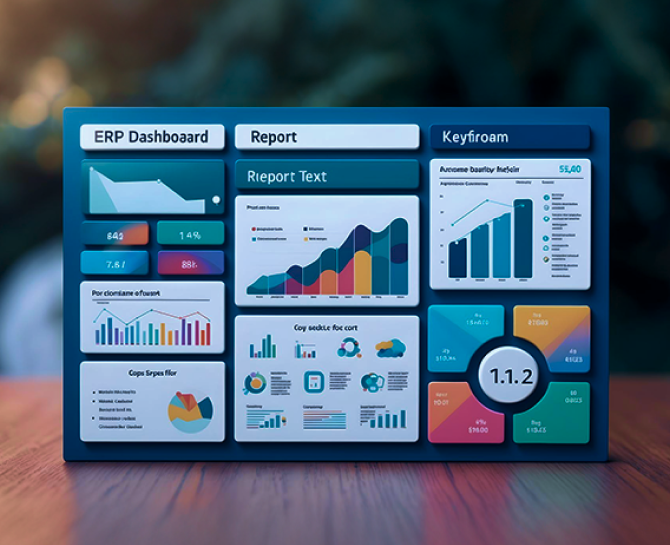
How to Build a Business Dashboard That Avoids the Most Common Mistakes
A business dashboard should simplify decisions, not complicate them. This article explains how to build a business dashboard that avoids typical pitfalls, focuses on actionable metrics, and creates clarity for decision-makers. By applying the right approach, your dashboard becomes a tool for growth instead of confusion.
If you were asked to name the five most important numbers driving your business, could you do it without hesitation? Most leaders cannot. They build dashboards packed with colorful charts, dozens of KPIs, and endless drill-downs, only to end up staring at clutter that raises more questions than it answers.
Here is the uncomfortable truth: a business dashboard is supposed to simplify decision-making, yet most of them do the opposite. They mislead, distract, or overwhelm. That is not a data problem, it is a design problem.
The difference between a dashboard that drives growth and one that wastes screen space is not how much data you show, but how intelligently you choose, structure, and present it. If you believe your dashboard is working just because it “looks good,” think again.
Key Takeaways
- A cluttered dashboard with dozens of KPIs does more harm than good.
- Trust in dashboards is built on data accuracy and a single source of truth.
- Visualization choices should simplify data, not distort it.
- Dashboards must be tailored to the audience and their decision-making needs.
- Continuous testing, automation, and maintenance keep dashboards relevant and reliable.
The Most Common Dashboard Mistakes
Building a business dashboard is not about plugging data into charts. It is about turning raw numbers into insights that support decision-making. Yet, many dashboards fail to deliver value because of these common mistakes:
Overloading With Too Many Metrics
Dashboards often look like data dumping grounds. Instead of highlighting what matters, they display dozens of KPIs at once. This makes it impossible to prioritize. Research in cognitive psychology shows that people can only process a limited number of visuals at once. A cluttered dashboard leads to analysis paralysis rather than clarity.
Poor Visualization Choices
The purpose of visualization is to simplify data. But poor choices, such as 3D pie charts, excessive colors, or using line graphs for categorical data, can distort perception. For example, a trend line showing churn rates over time is far more effective than a pie chart that offers no time-based insight.
Ignoring User Needs and Context
A dashboard is only useful if it serves its audience. Executives want high-level KPIs that indicate overall performance, while operational teams need granular details. Designing the same dashboard for everyone ensures that no one gets what they need. Successful dashboards are tailored to the user’s role and decision-making needs.
Lack of Regular Updates and Maintenance
A dashboard is not a one-time project. Data pipelines break, business goals evolve, and KPIs change. Without scheduled reviews and automated updates, dashboards quickly become outdated. Out-of-date numbers can misguide decisions and create costly mistakes.
How to Build the Dashboard the Right Way
Avoiding mistakes is only half the equation. The real value comes from building dashboards that are practical, clear, and aligned with business goals. Here are the key steps to do it right:
1. Define the Right Metrics and Goals
The single most important reason dashboards fail is that they track the wrong things. A business dashboard should not be a mirror of all available data. Instead, it should act like a compass, pointing decision-makers toward outcomes that matter.
Start With Business Objectives: Every metric you choose must tie back to a business goal. For example, if the objective is increasing revenue, the relevant KPIs could be monthly recurring revenue (MRR), upsell rates, and customer lifetime value (CLV). If the objective is customer retention, churn rate and net promoter score (NPS) are far more relevant than website traffic.
Avoid Vanity Metrics: Vanity metrics look impressive but rarely influence decision-making. Page views, app downloads, or email open rates can boost confidence but do not necessarily reflect growth. Actionable metrics, on the other hand, provide insights that can directly guide action.
Balance Leading and Lagging Indicators: Effective dashboards track both
- Leading indicators (predict future performance): pipeline volume, demo requests, website conversions.
- Lagging indicators (measure past outcomes): revenue generated, customer churn, profit margins.
Vanity Metrics vs Actionable Metrics
| Vanity Metrics (Looks Impressive) | Why They Mislead | Actionable Metrics (Drives Decisions) | Why They Matter |
|---|---|---|---|
| Social media likes | Engagement without context. | Customer acquisition cost (CAC) | Shows efficiency of marketing spend. |
| Website page views | Traffic does not equal revenue. | Conversion rate | Reflects how effectively traffic turns into customers. |
| Email open rate | Opens do not indicate interest. | Revenue per campaign | Links directly to ROI. |
| App downloads | Installs without retention. | Churn rate | Reveals long-term customer value. |
Pro Tip- By prioritizing actionable, goal-driven, and balanced metrics, your dashboard becomes more than a data visualization tool, it becomes a strategic decision-making partner.
2. Choose the Right Tools and Structure
A business dashboard is only as powerful as the tools and integrations that fuel it. The wrong choice of platform can leave you with pretty visuals but limited insights. The right choice enables real-time visibility, scalability, and role-based access that keeps everyone, from executives to team members, aligned.
Select the Right Business Intelligence (BI) Tool
Not every organization has the same needs. A startup tracking marketing campaigns requires very different functionality compared to an enterprise managing global supply chains. Here are popular BI tools and what they are best suited for:
| BI Tool | Best For | Key Strengths |
|---|---|---|
| Power BI | Enterprises & SMEs | Strong integration with Microsoft ecosystem, scalable for large datasets. |
| Tableau | Data-driven organizations | Advanced visualization, deep customization, strong community support. |
| Google Looker Studio | Marketing and web analytics | Free, integrates seamlessly with Google Analytics, user-friendly. |
| Qlik Sense | Businesses with complex data models | AI-driven insights, strong associative data modeling. |
| Domo | Companies needing mobile-first dashboards | Cloud-native, strong collaboration features. |
| DiGGrowth | Businesses focused on growth analytics | Combines BI with marketing and revenue attribution, integrates across CRM and campaigns. |
Ensure Seamless Data Integration
- A dashboard without clean, connected data is just an empty shell.
- CRM platforms (Salesforce, HubSpot, Zoho) for customer and sales data.
- ERP systems (SAP, Oracle, NetSuite) for financial and operational metrics.
- Marketing analytics tools (Google Analytics, DigGrowth, HubSpot Marketing Hub, SEMrush) for campaign performance.
- Custom databases/APIs for proprietary business data.
3. Design for Clarity and Usability
A dashboard is only as valuable as its ability to communicate insights at a glance. If your users need to squint, scroll endlessly, or decode complicated charts, the dashboard has already failed. Good design does not just make dashboards look clean, it makes them actionable.
Prioritize Simplicity in Visualization
- Use line charts to highlight performance trends over time (e.g., sales growth month by month).
- Use bar or column charts for comparing categories (e.g., revenue by product line).
- Use heat maps to surface anomalies (e.g., customer churn rates by region).
- Avoid 3D charts, excessive gradients, and rainbow palettes, as they distort perception.
Apply Consistent Formatting
- Standardize labels, date formats, and number scales across all dashboards.
- Use a limited, purposeful color palette (e.g., green for positive, red for negative).
- Keep legends and filters intuitive and visible at all times.
Highlight What Matters
Do not treat the dashboard as a raw data dump. Draw the eye to insights that require action:
- Growth opportunities (upsell-ready customers, markets exceeding revenue targets).
- Warning signals (declining conversion rate, cost per acquisition trending upward).
- Thresholds and benchmarks (SLA compliance, budget variance).
DiGGrowth Advantage: Unlike many generic BI platforms, DiGGrowth emphasizes storytelling through data. Its visualization layer is designed to spotlight anomalies and trends automatically, reducing the risk of “dashboard blindness.” For marketing teams in particular, this means less time digging through graphs and more time acting on insights.
Poor vs Effective Visualization Examples
| Poor Visualization Choice | Why It Fails | Effective Visualization | Why It Works |
|---|---|---|---|
| 3D Pie Chart showing revenue split | Distorts scale, hard to compare slices | Bar Chart | Enables clear side-by-side comparisons. |
| Overlapping Line Graphs with 10+ series | Creates visual noise | Single Line + Highlighted Trend | Focuses on the most critical metric. |
| Heat map with random color palette | Confuses meaning | Red-Green Gradient Heat Map | Universally understood signals. |
Pro Tip- By treating dashboards as decision tools, not decoration, and by leveraging solutions like DiGGrowth that prioritize clarity, you ensure your teams spend less time interpreting and more time executing.
4. Test, Iterate, and Maintain
Launching a dashboard is not the end of the process, it is the beginning. Without continuous testing and updates, even the best-designed dashboards lose credibility and relevance. A dashboard must evolve with the business, technology, and data it represents.
Check for Data Accuracy Before Launch
- Verify that every metric is pulling from the correct source.
- Run a reconciliation check between dashboards and original data sets (finance reports, CRM entries).
- Incorrect data kills trust instantly, users may never rely on the dashboard again.
Gather Ongoing Feedback From Users
- Executives might request higher-level summaries.
- Sales managers may need deeper drill-downs into deal stages.
- Marketers could ask for attribution metrics beyond impressions.
- Collect feedback regularly to refine dashboards to user needs.
Automate Where Possible
- Set automated data refresh schedules (daily, weekly, real-time).
- Create alerts for anomalies (e.g., sudden drop in conversion rate).
- Build security controls to prevent unauthorized access to sensitive KPIs.
Schedule Maintenance Reviews
- Quarterly reviews ensure dashboards stay aligned with evolving business goals.
- Replace outdated KPIs (e.g., focusing only on clicks instead of engagement quality).
- Evaluate whether the tool still meets the team’s growing data complexity.
Conclusion
A well-designed business dashboard is more than a reporting tool, it is a decision-making companion. The value lies not in showing more data but in showing the right data at the right time, in the right way. When dashboards are thoughtfully structured, visually clear, and consistently maintained, they can shift how leaders and teams act on insights.
The companies that succeed with dashboards are those that treat them as evolving systems, not static reports. They refine them with user feedback, integrate them with the right tools, and most importantly, align them with business objectives. With the right approach, your dashboard does not just inform decisions, it accelerates them.
Ready to turn your dashboard into a growth engine? Talk to Us!
Our experts at DiGGrowth can help you build dashboards that simplify complexity, highlight what truly matters, and keep your teams focused on outcomes. Write to us at info@diggrowth.com and we’ll get back to you.
Ready to get started?
Increase your marketing ROI by 30% with custom dashboards & reports that present a clear picture of marketing effectiveness
Start Free Trial
Experience Premium Marketing Analytics At Budget-Friendly Pricing.

Learn how you can accurately measure return on marketing investment.

How Predictive AI Will Transform Paid Media Strategy in 2026
Paid media isn’t a channel game anymore, it’s...
Read full post post
Don’t Let AI Break Your Brand: What Every CMO Should Know
AI isn’t just another marketing tool. It’s changing...
Read full post post
From Demos to Deployment: Why MCP Is the Foundation of Agentic AI
A quiet revolution is unfolding in AI. And...
Read full post postFAQ's
Dashboards rarely need complete redesigns; instead, quarterly reviews and iterative improvements usually keep them effective and aligned with evolving business goals.
Yes, advanced dashboards can integrate predictive analytics to forecast trends, enabling proactive decisions rather than relying solely on historical performance data.
Even the best dashboard fails without user understanding. Short training sessions ensure teams can interpret visuals correctly and act on insights confidently.
Mobile dashboards provide real-time access to KPIs on the go, ensuring decision-makers remain informed and responsive even outside office environments.