The Significance of Data Visualization Dashboard in the Modern Data Ecosystem
Discover how data visualization dashboards transform raw data into actionable insights, enhancing decision-making through interactive elements and clear visualizations. Learn about dashboard types, best practices, and the importance of security and training to master this essential tool for modern data-driven strategies.
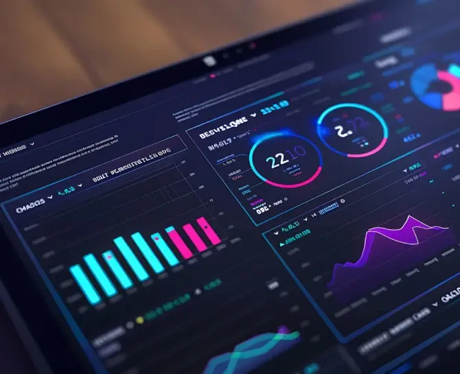
Data visualization dashboards transform raw data into visual stories, enabling decision-makers to grasp complex concepts quickly, discern business patterns, and identify actionable insights. They form a nexus of business intelligence, where data speaks in the language of graphs, charts, and interactive elements. This synthesis of information presents a competitive advantage, offering at-a-glance understanding that can underpin swift and informed decisions.
While traditional reporting often relies on text-heavy documents or spreadsheets that require time-consuming analysis, data visualization dashboards stand apart. They offer immediate clarity through visual representation. Where a traditional report may tell you the numbers, a dashboard shows your data’s shape. This visual context enhances comprehension, enabling a more nuanced understanding of trends, outliers, and correlations that might otherwise remain buried in columns of figures.
Data visualization elevates the comprehension of complex datasets by representing information through graphical elements. As the human brain processes visual information exponentially faster than text, visuals make intricate data patterns discernible at a glance. Consequently, professionals across various industries leverage these tools for in-depth data analysis.
Key Takeaways
- Data visualization dashboards convert raw data into clear, actionable insights, enabling quicker and more informed decision-making than traditional text-heavy reports.
- Tailor dashboards with interactive charts, dynamic filters, and personalized metrics to enhance user engagement and relevance across different organizational roles.
- Implement robust security measures, such as encryption, role-based access, and privacy controls, to protect sensitive information and ensure compliance with data protection regulations.
- Equip your team with the skills to use data visualization dashboards effectively through targeted training and support. It will maximize the tool’s potential and foster a data-driven culture.
Accelerating the Decision-Making Process
Deploying a data visualization dashboard leads to swift decision-making. Decision-makers no longer sift through raw data; instead, they rely on visual representations that illustrate trends, outliers, and patterns. This efficiency is paramount when time is scarce and strategic decisions hinge on the prompt understanding of data narratives.
Metrics and Key Performance Indicators at the Forefront
Metrics and Key Performance Indicators (KPIs) underpin most business strategies. Data visualization dashboards serve as a centralized platform to track these vital signifiers for a website. Through these dashboards, organizations maintain a pulse on their operational health, and KPIs guide strategic pivots and investment foci.
Since dashboards present data dynamically, stakeholders gain instant insights into performance against predefined objectives. Moreover, certain KPIs interconnect, telling a holistic story of departmental or organizational efficiency, growth, and potential areas for improvement. The clarity with which these metrics are presented influences operational tactics and long-term strategic roadmaps.
Questions such as “How are we performing on key metrics?” and prompts for reflection like “What does this spike in user engagement signify in terms of our product’s market fit?” become more instinctual to answer with a well-constructed data visualization dashboard.
Explore the Different Types of Data Visualization Dashboards
Shift through the various data visualization dashboards and determine which aligns best with your business objectives. Different dashboards serve diverse functions, from day-to-day operations monitoring to high-level strategic decision-making.
Operational Dashboards
Operational dashboards display real-time data to monitor the immediate health of systems and processes. Management teams often use these dashboards to track performance continuously throughout the day. Examples include call center dashboards displaying current call volume and response times or manufacturing dashboards showing production line statuses.
Analytical Dashboards
Analytical dashboards process past data to identify trends and patterns, which assist in deeper analysis and forecasting through data aggregation. These dashboards typically contain more complex data sets and are used by data analysts or professionals who need to pull insights from large amounts of data over time. For instance, a marketing team might use an analytical dashboard to measure campaign performance over the past quarter.
Strategic (Executive) Business Dashboards
Strategic dashboards summarize key performance indicators (KPIs) and critical metrics to help executives make informed long-term decisions. They offer a high-level view of a company’s health and trajectory without excessive detail that might obscure overall trends and objectives. A CEO might, for example, use a strategic dashboard to track the company’s revenue growth, market share, and operational costs.
These dashboards combine vibrant visuals with concise data presentations, allowing users to digest complex information quickly. By selecting the type of dashboard that resonates with your goals, you facilitate better data-driven strategies within your organization.
Enhancing Engagement with Dashboard Interactivity Features
Users expect not only to view data but to interact with it. This need translates into implementing dynamic filters and drill-down capabilities, ensuring users don’t just observe data passively but engage with it to extract meaningful insights.
Dynamic Filters and Drill-Down Capabilities
The inclusion of dynamic filters enables customization of the data displayed, allowing users to single out the metrics relevant to their specific queries or tasks. These filters can be as straightforward as date ranges or as complex as multi-variable selectors.
Adding drill-down capabilities transforms the user’s interaction with a dashboard from a static experience to an explorative journey. Users can click on certain elements for more detailed information, peeling back data layers to reveal subtler trends and correlations.
These features streamline the data analysis process and empower users to conduct deep dives into the datasets at their fingertips easily.
Interactive Elements for Enhanced User Experience
- Embedding interactive charts provides a visual representation that users can manipulate, such as adjusting axes or selecting categories to highlight within complex datasets.
- Toggle switches allow users to swiftly change between different data types or views without requiring multiple steps or navigation away from the current page.
- Incorporating hover-over information boxes presents additional data points and contextual information, reducing clutter on the main dashboard view and presenting data on-demand.
When users interact with these elements, they gain an enriched understanding of the datasets and the narratives they tell. Engagement increases as users fine-tune the information presentation to suit their preferences or investigative needs.
The true power of a data visualization dashboard lies in its ability to evolve from a static collection of charts into a dynamic and interactive data exploration tool. Dashboard interactivity invites users not merely to receive information but to participate in elucidating their own data-driven stories.
Security and Privacy Considerations in Data Visualization Dashboards
As data visualization dashboards centralize a vast array of information, managing the security of this data stands at the forefront of any designer’s or organization’s priorities. Dashboards consolidate data and enable its analysis and dissemination, which may expose sensitive information without the proper safeguards. Ensure robust protection mechanisms against unauthorized access and possible data breaches.
Privacy aspects become particularly significant when dashboards are shared across various levels of an organization or with external stakeholders. Users must be able to control who views their data and understand the risks involved in data sharing. Adequate privacy controls allow for the distribution of dashboard information without compromising confidential or private information.
Managing Data Securely in Dashboards
- Data encryption at rest and in transit provides a critical shield against eavesdropping and interception.
- Authentication protocols such as multi-factor authentication reduce the risk of unauthorized dashboard access.
- Role-based access control ensures that users can only view or manipulate data as per their permissions, thereby reducing the risk of data leakage or accidental disclosure.
- Regular security audits and updates help identify vulnerabilities early and fortify the dashboard against evolving threats.
Privacy Aspects in the Sharing of Dashboard Information
- Anonymization and data masking techniques obscure sensitive details, enabling users to share dashboard insights without revealing personal or confidential information.
- Data governance policies are critical for establishing clear rules and guidelines for data usage and ensuring compliance with privacy laws and regulations.
- Clear data retention and deletion policies help manage the information lifecycle displayed in dashboards, preventing the unnecessary storage of sensitive data.
- Consent mechanisms may be necessary for dashboards to collect personal data and align practices with privacy standards such as GDPR or CCPA.
Addressing the security and privacy aspects of data visualization dashboards enables organizations to harness the full potential of their data while maintaining trust and compliance. Through careful planning and the implementation of robust security measures, dashboards transform into indispensable tools that convey critical insights and preserve the integrity and confidentiality of the data they present.
Enhance Your Team’s Proficiency in Data Visualization Dashboards
The success of a data visualization dashboard within an organization correlates directly with the team’s proficiency in its use. Adequate training programs and adoption strategies ensure users can leverage the full potential of these powerful tools.
Addressing User Adoption Challenges
Adoption rates of data visualization dashboards can fluctuate based on an individual’s familiarity with the system, the perceived complexity of the tool, and the value it brings to their role. Recognizing these factors guides the development of a comprehensive support system that accelerates user adoption. Address challenges by providing hands-on experience, clear documentation, and ongoing support to your team members.
Mastering the Dashboard for Superior Insights and Performance
Mastery of data visualization dashboards unlocks a world of potential. With the correct application, organizations can gain unparalleled insights and drive performance at optimal levels. Regardless of the industry, the power to visualize data concisely and effectively translates directly to enhanced decision-making capabilities. As the amount of data businesses generate expands exponentially, this competency is no longer optional; it is a fundamental requirement for success.
Exploring the vast landscape of dashboard tools and practices has revealed a wealth of options to consider. Faced with various dashboard types, design principles, and interactivity features, professionals across sectors can harness these tools to tailor powerful data narratives. Each choice in creating and implementing a dashboard—from the data sources integrated to the colors—profoundly impacts the finished product’s usability and effectiveness.
Consider delving deeper into the tools and strategies mentioned throughout this exploration.
Just write to us at info@diggrowth.com to identify which aspects resonate most with your needs and help create a data-driven culture within your organization.
Ready to get started?
Increase your marketing ROI by 30% with custom dashboards & reports that present a clear picture of marketing effectiveness
Start Free Trial
Experience Premium Marketing Analytics At Budget-Friendly Pricing.

Learn how you can accurately measure return on marketing investment.

How Predictive AI Will Transform Paid Media Strategy in 2026
Paid media isn’t a channel game anymore, it’s a chessboard. Search, social, programmatic, video, influencer, native,...
Read full post post
Don’t Let AI Break Your Brand: What Every CMO Should Know
AI isn’t just another marketing tool. It’s changing how we connect with customers, personalize content, and...
Read full post post
From Demos to Deployment: Why MCP Is the Foundation of Agentic AI
A quiet revolution is unfolding in AI. And it’s not happening inside research labs. For decades,...
Read full post postFAQ's
Data visualization simplifies complex data, making it easier to quickly identify patterns, trends, and actionable insights, enhancing decision-making and efficiency.
Dashboards present data visually, allowing users to instantly grasp trends and outliers. It enables faster and more informed decisions than raw data analysis.
There are operational dashboards for real-time monitoring, analytical dashboards for trend analysis, and strategic dashboards for high-level performance tracking and long-term decision-making.
Dashboards can be tailored with interactive elements, dynamic filters, and personalized metrics to align with different roles and business objectives, enhancing their relevance and usability.